Since this model was a commission, the build process was a little different than usual. The request was to make a manor very similar to Leanan, but a bit larger, and with full interior.
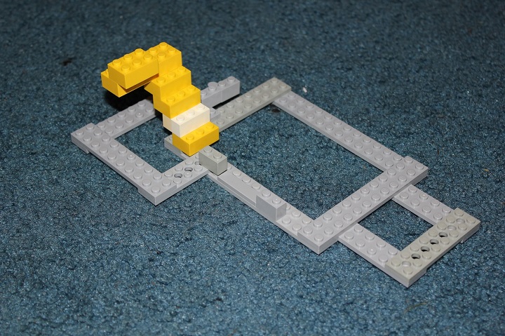
I started with the building layout, and after some trial and error came up with this. The white and yellow bricks showed how a staircase could fit, and the hinge brick marked the chimney and hinge point of the model.
The wall texturing consisted of 1×1 bricks and 1×2 plates in sand green, along with 1×1 round tiles and plates in bley. The basic design allowed me to use only one stud thick walls and maximize interior space. To add more visual interest to larger sections of the building, I incorporated some buttresses and recesses.
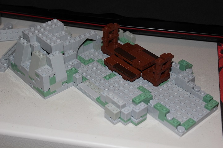
By the end of the first level I was quite pleased with how the castle was shaping up. To keep the interiors super easy to access, I had decided to make the castle modular in addition to hinging open. The simple bricks up construction kept the model quite solid.
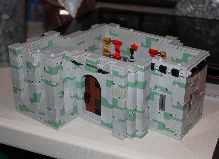
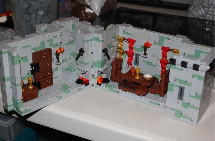
Some banners and torches added a bit of color inside.
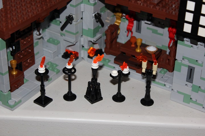
As the second floor was added, I needed a candle holder design, so I came up with several and then asked the client which he preferred. The center design ended up being used.
The finished second story adds a lot with the tudor section and bartizan over the door. The flag position ended up being adjusted later.
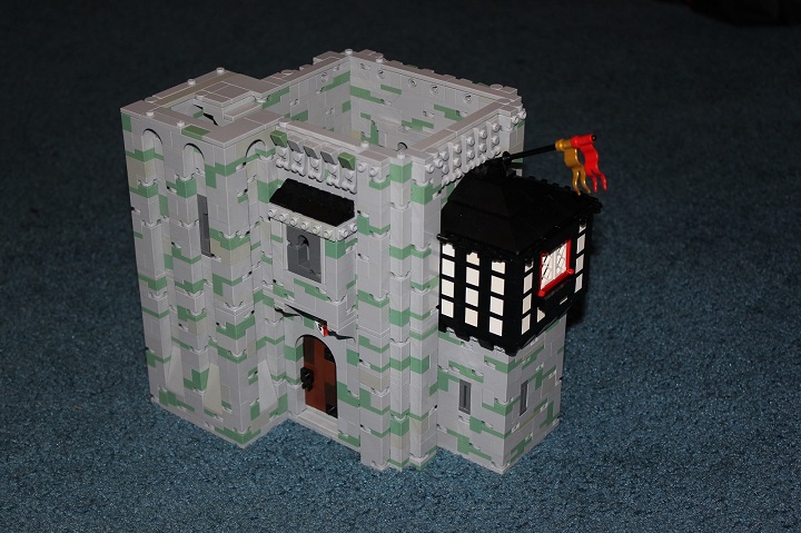
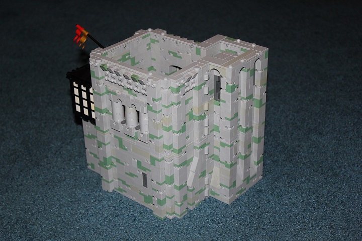
One of my goals with this model, just like the original Leanan Manor, was to have every side be interesting. The manor’s layout helped make that easier, while the gallery and chimney add more detail. The 2×2 plate with 2 stud on top of the buttresses were switched out for inverted slopes later.
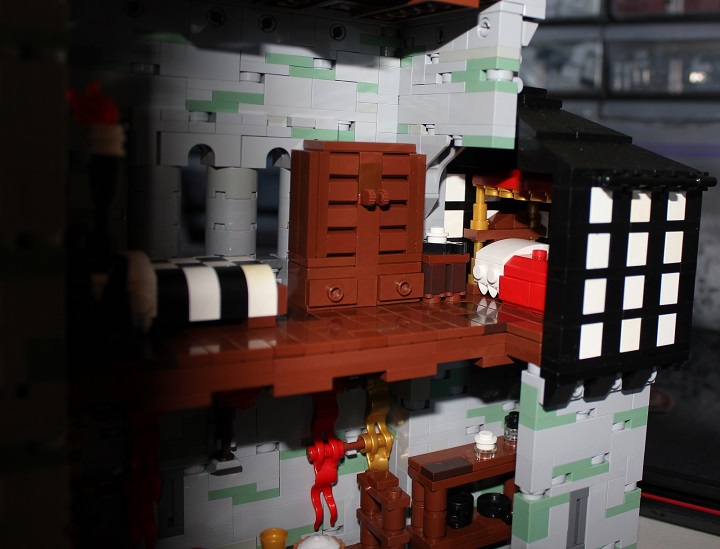
Main living quarters are located on the second floor and are furnished with two beds, a desk and chair, dresser, wardrobe, and two lampstands.
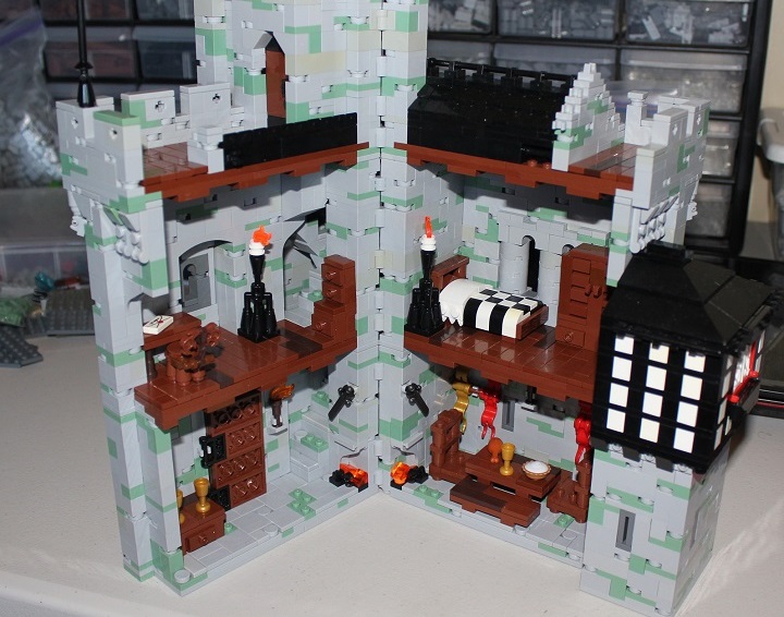
The second and larger bed fit nicely in the tudor addition.
The finished manor! It took me quite a few tries with different color options before I found what I liked best for the upper window shutters. Previous versions included checkered red/white, white on black, and red on white.
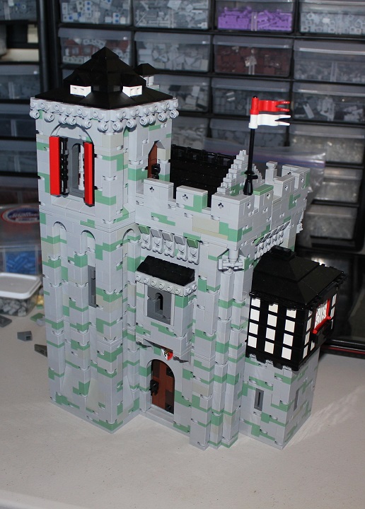
Another area which took some experimentation was the battlements by the roof. You’ll notice they are a bit lower than the actual crenelations, but still follow the general design pattern. I thought that was the best compromise in highlighting the roof, and still making it consistent.
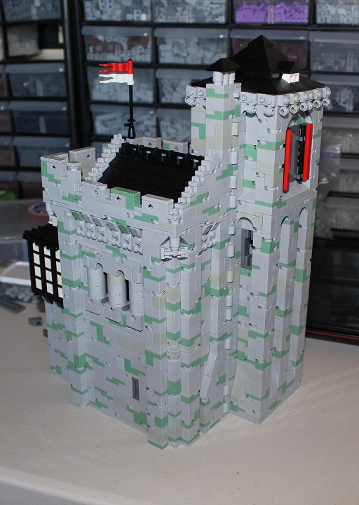
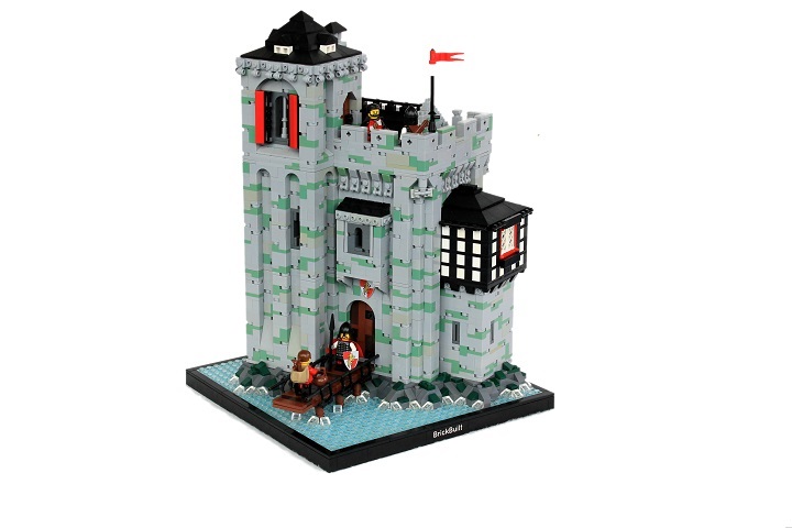
The manor by itself was all that was needed for the commission, as the client was going to add it to his own landscape. I placed it a simple rock outcropping in a lake to finish the model for myself.
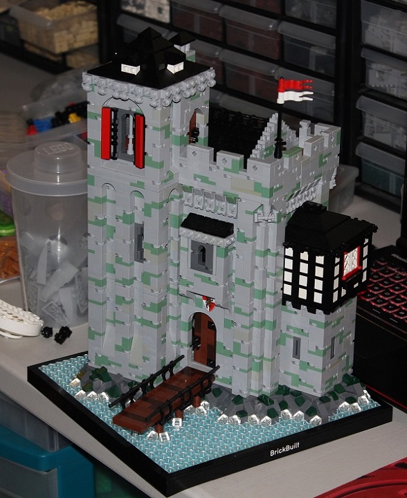
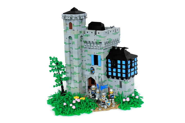
And here is a comparison of Leanan and Leanorll Manor.


Awesome job guys! The bridge is easily one of my favorite part, and the interior is also really nice, keep it up guys!
Amazing, love it!!! thanks for sharing!!